Making a Picture Book- A Poem Grows Inside You

A Poem Grows Inside You, written by Katey Howes, Published by The Innovation Press and illustrated by me!

Hello friends! It has been a while since my last post, mostly because I spent the last year saying “Yes!” to every opportunity that came my way, and while it was a fantastic year of learning and growing, one of the most important lessons I learned is that I actually can’t do everything… who knew? (Ok lots of people knew that) But that isn’t what I want to talk about today. In this post I want to share my experience illustrating this beautiful manuscript by Katey Howes!

Every book has a story, the story that happens before the story. Actually several stories because everyone involved in making a book has their own story for how they came to be part of it. My story for this book begins with— it was the first time a traditional publisher offered me a picture book to illustrate. This was HUGE! Something I had been working towards for a few years, and the theme and manuscript and publisher were all so appealing to me, I could not have been happier. Some of you might notice that this is actually the second book I have illustrated, and that is because publishing can be like that but also largely because of the pandemic. I got the offer for A Poem Grows Inside You in March of 2020… yup. I remember standing outside the elementary school while my dog and I waited to walk my daughter home from school, I had just gotten off the phone with my agent, and looking forward to spring break with my kids…. which ended up lasting a year and a half. Because of those Uncertain Times, (remember when every sentence started with “In these uncertain times”?) The Innovation Press decided to delay the book for a year, which made perfect sense as absolutely no one knew what was coming at us.

It was hard to wait, but also everything was hard and I was very busy doing things like buying too much spaghetti squash because what if the stores ran out of spaghetti squash. And it gave me a long time to think, and to experiment with different mediums. And without that time I doubt I would have discovered the process I used for this book.

This is an early style guide I made once I decided on a medium, to show the publisher the technique I had in mind and the character design. We made a few tweaks, including the color of the raincoat.

For me, everything starts with thumbnails. This is probably the hardest part of the process for me- lots of talking to myself and tugging on my hair and making cups of tea I never finish. But once they are done, I feel like I have a roadmap to follow. I get lost really easily so I love maps.

Now for that technique I mentioned. I really don’t know if I would have discovered this without the pandemic keeping us all at home and giving me so much time to experiment. I would trade not knowing this for COVID never having happened but, here we are. It starts with sanded paper- the kind usually used for pastels. I am not a pastel artist so I can’t even remember where I got it. It’s literally sand paper, very fine white sand glued to a paper backing. When I painted on it with acrylic gouache, it would behave like watercolor or gouache depending on how much water I added, and going over that with colored pencils created a rich, bold line and a texture I fell in love with.

Some books start with the cover, and with others the cover comes last. It all depends on the publisher and their marketing schedules. This book came cover first, and I decided to paint the background and character separately so things could be tweaked and nudged in photoshop. I have done this for all my book covers so far- you really get the benefit and security of working in layers while still using traditional media.

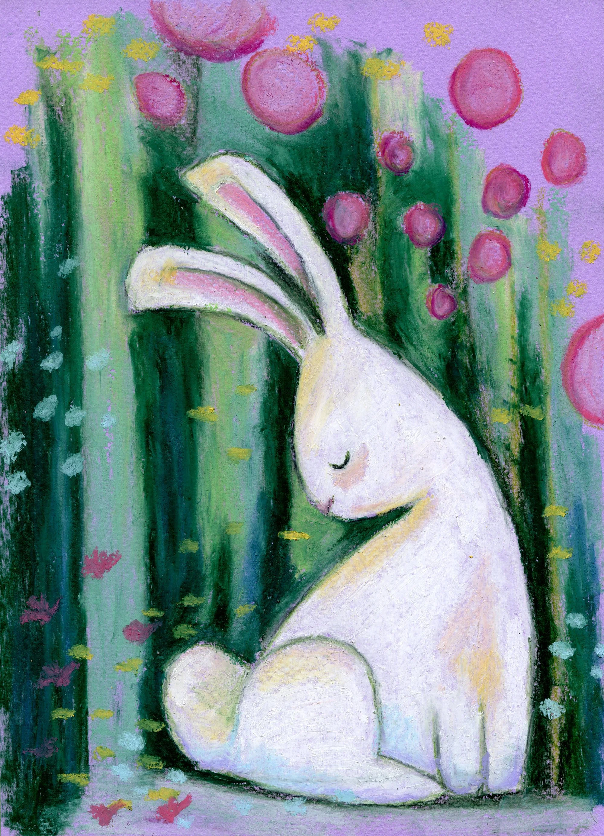
Here are a few more process images. I really loved painting this book, Katey’s words are just wonderful and I would find her phrases repeating in my head as I painted various spreads. And the Innovation Press has been such a fantastic publisher to work with, with great taste in books I might add! I hope you will all enjoy reading and sharing it with children as much as I did illustrating it!

If you have any other comments or questions feel free to drop a comment below! Thanks for hanging out with me :)

Art Show at The Wandering Jellyfish

Hello friends! As my art show at The Wandering Jellyfish Bookshop draws to a close this week, I thought some of you might like to hear about the background of each painting. Also, if you are not local or your favorite painting already sold, I am offering prints in my Etsy Store

For those of you that bought a painting, please remember to pick it up by May 6 or 7 (and thank you!)

Uncertain Future

This first painting is titled Uncertain Future and I think it probably speaks for itself. We have so much uncertainty in our lives right now, on a global and national scale as well as in our personal lives. I painted this to remind myself that we need to continue on with bravery, even when what is ahead may be murky. This was done with watercolor paint and colored pencil.

After the Fire

After the Fire was painted at the very beginning of this year, after the terrible Marshall fire devastated nearby communities. The next day, our first snow of the winter came months later than usual. It felt like a blanket of healing and comfort- but it was bittersweet to think if it had just come a day or two sooner, the fire may have been avoided. Of course it isn’t that simple, the strong winds that brought the snow were the same that fed the fire. Colorado is also on the migration route of white pelicans- beautiful, huge birds that always feel mystical when I spot them at one of our lakes. I have always loved them and their magical feeling seemed the right choice for this piece, which I painted with watercolors.

Rabbit in Contemplation

This little piece, Rabbit in Contemplation, was done as an experiment, one of my first times trying out oil pastels. There isn’t much of a backstory to this except that I really love painting rabbits, and I think it’s fun to imagine they might have a rich internal life. !

Reading Nook

Reading Nook was painted from one of several sketches I made for the cover of the SCBWI 2022 Essential Guide to Publishing for Children (you can see the one we went with here) I liked it so much, I decided to paint it for fun. For this I used watercolor and colored pencil on printmaking paper.

Moving Day

Moving Day was painted a couple years ago, when I started using gouache more. It was inspired by an SCBWI Draw This contest prompt, and while I didn’t win that month I did end up with a piece I am really happy with. This is why I think it’s always a good idea to enter challenges and contests- IF they inspire you and if you have time. Ultimately, if the reward is personal growth and a portfolio piece, you have already won!

If We Can Imagine a Better World, We Can Create It

If We Can Imagine a better World, We Can Create It- because part of the job of artists is to show the world how things could be better. Without imagination, we can’t problem solve and create a better future. I don’t think you need to be a visual artist to take part in this movement, any person with vision and motivation can contribute to imagining a better way for us to be. This piece was painted on sanded paper with acrylic gouache and colored pencil. Acrylic gouache on sanded paper behaves a lot like watercolor- which is a blog post for future me to write :)

Book Love

Book Love was painted for a valentine collection for my literary agency, East West Literary. The ermine is the same character as Lounging Ermine (coming up) and this was painted with watercolor, gouache and colored pencil on printmaking paper.

Lounging Ermine

Lounging Ermine’s story came about pretty organically- I had painted my dog and one of my critique partners thought it was an ermine. Which got me looking at photos of ermines, and then desperately needing to paint one. The curved, graceful shape she makes inspired the bedroom, tea and thoughtful gaze. This pieces was also painted in watercolor and colored pencil on printmaking paper.

The Feast

The Feast is one of my favorite paintings, because I would really like to join that party in those autumn woods. I can see myself paintings this group of friends again. This was a very experimental piece which started with colored pencil, then I layered gouache, crayon and more pencil over it. It can also be seen in the 2022 RMC SCBWI calendar.

Flower Umbrella

Flower Umbrellas or giant bouquets is a reoccurring theme in my sketchbook. This piece was done on brown art paper with gouache and oil pastel.

I hope you enjoyed hearing a little more about my thought process and mediums, and even if you don’t make it there during my show I do hope you will check out The Wandering Jellyfish Bookshop in Niwot, CO. It is a beautifully curated shop specializing in children’s literature from picture book to young adult- but I also always find something on the adult shelf to buy too! Thank you for reading, and be well.

My painting process using digital and traditional media

Hello friends and welcome to my very first blog post! I want to start out today talking about the process I use to create most of my paintings. I often hear illustrators asked if they work traditionally or digitally, and there is certainly no wrong answer to this. I adore many illustrations that were made either completely digitally or with traditional methods. In the end, the principles of good illustration are the same. But my personal answer to that question is WHY NOT BOTH? I love using digital tools to streamline my process, correct mistakes and elevate the image in general- but when it comes time to sit down and paint, I much prefer to work on paper. There are a lot of reasons for that- my background in fine art, my wrist and eye health, and maybe most of all my love for experimenting with different papers and supplies. I will talk a lot more about paper specifically in future blog posts because I think it is the unsung hero of art making. But for now, I want to lay out my basic process for creating a painting (including the ones in my upcoming picture books)- I hope you enjoy!

Running Into Spring

Everything starts in my sketchbook, whether it’s scribbled thumbnails or something more finished like this piece, which was inspired by the way Colorado has many more than four seasons, often in the same week. (Like around 20?) I think better on paper so most of my brainstorming happens with a pencil.

Next, I like to refine the sketch on my iPad. Procreate is great for this- you can select and resize, flip the image to check the composition and figure out your palette. Once I’m happy with the line drawing, I’ll often block in color. It’s an extra step, but it helps me to figure out the palette and values beforehand so I’m not guessing once I go to paint. 

This is also a great way to check that the values are working. 

Next, I print out the sketch to the size I want to paint. If I am working on a picture book, I might need to print out several sheets and tile them together to get the correct size. Here, I’m just using what fits on an  11”x17” piece of recycled printer paper. 

Speaking of paper… now I get to choose what kind to paint on! I obviously have lots of options, and for this painting I decided on a cream colored printmaking paper. It’s soft and absorbent with no sizing, and I really like using watercolor and colored pencil on it. 

I have a big light box my husband bought me from an architecture firm a few years ago for Christmas (he found me some great flat files too!) and I use it constantly for tracing sketches onto the paper. 

This is my favorite part, the painting process. It never looks great at this stage, but I love the way the brush, paint and paper all interact. It’s very soothing. 

For this method, I do a lot of details in colored pencil. I try not to overwork or hide the interesting variations in the paint. 

Once I feel like it’s finished, it’s time to scan! I have a good scanner but it’s pretty small, so I have to scan in sections and end up with something like this:

Then I use the MAGIC of Photoshop’s photomerge feature to stitch it all together while I make a cup of tea!

Okay so, at this point I was going to tell you all that I use the clone stamp to clean up dust specks and the levels adjustment layer to tweak the values but… I realized I had a bigger problem. That shadow I had so much fun painting is shortening the distance between the girl and the snowy hills behind her. It kind of looks like a wall? If this were for a book, I would repaint the whole thing (or hopefully would have caught it much sooner in the sketch phase!) But since this is just a personal piece, I’ll use some more photoshop magic to select the shadow and tweak it so it looks like there is more distance. 

There! Smack my logo on it and it’s ready to post on instagram or a blog! Thanks for sticking with me this far. I hope you all enjoyed this sneak-peek into my studio and if you are a creative person too, I’d love to hear something about your process in the comments!